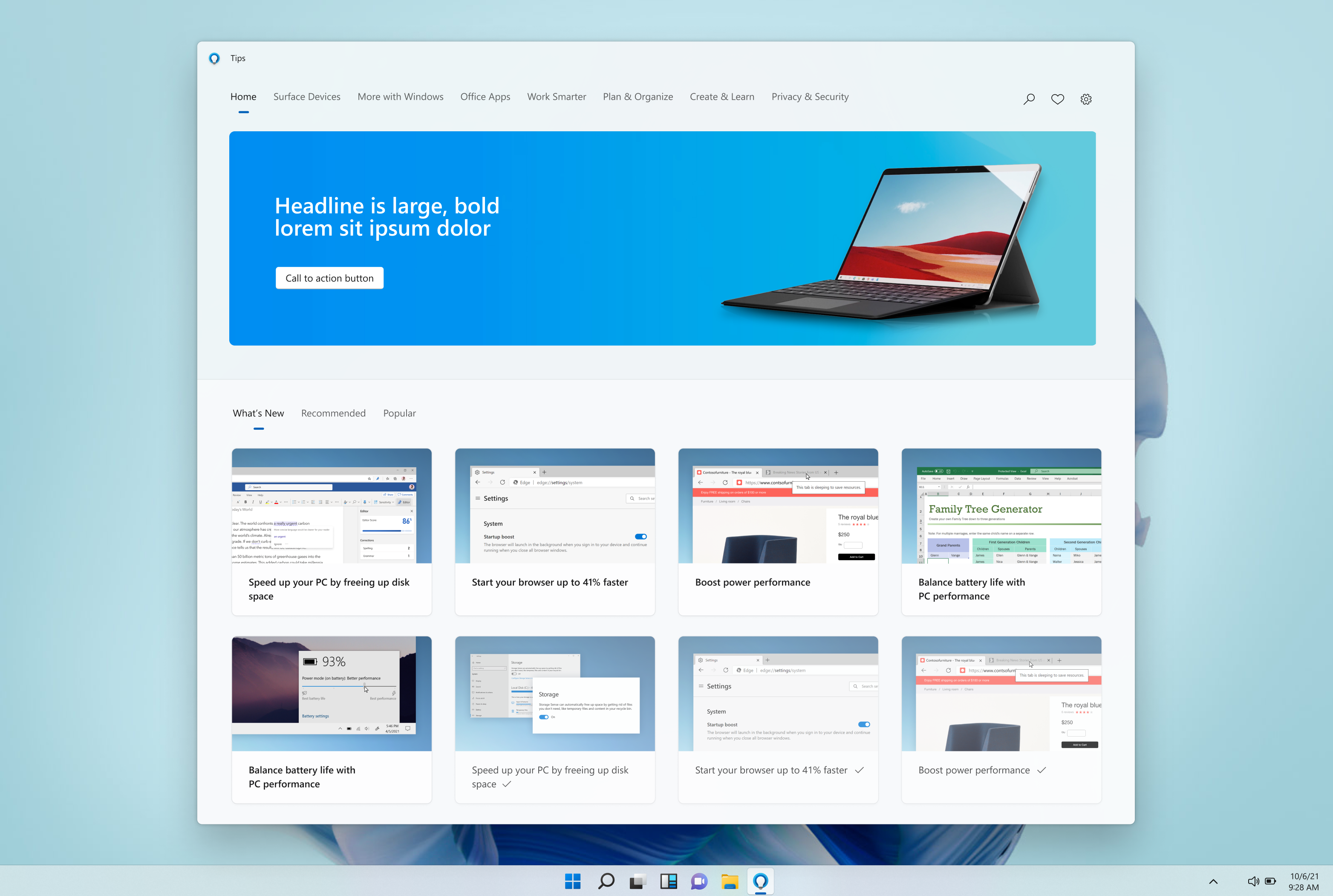
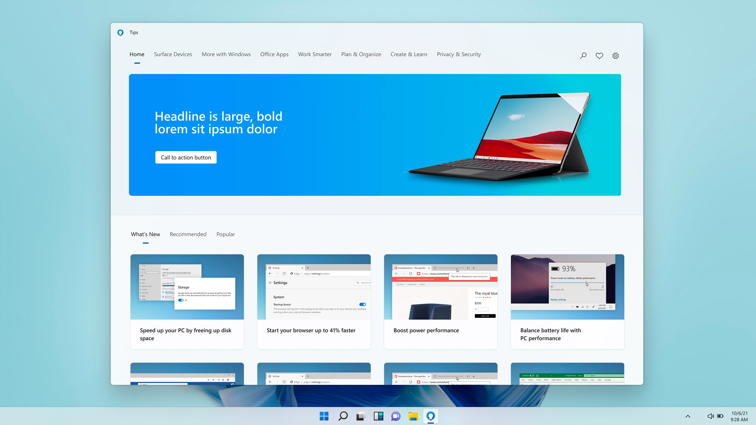
Before redesign


The existing Windows 10 Tips App design had some issues to address — color contrast for accessibility, a redundant/repetitive user of the “View tips” call to action, the lack of any visually engaging thumbnails or written content, various different gray color values not reading well, and a cumbersome navigation system of clicking through to cards nested within cards. These issues were the low hanging fruit that I wanted to give some thought towards right off the bat, along with all the polish and design upgrades to make the app feel a part of the overall Windows 11 design aesthetic. 
Proposed design


Here the user has opened the app and is greeted by a large colorful hero banner. The typography meets accessibility color contrast ratio standards, and cards do not overlay the hero section. Above the hero the user sees a navigation system in place, allowing them to quickly focus in on any topic they are interested in. At the bottom of the screen, the default pivot is set to “What’s New”, and the user sees colorful and engaging thumbnails, which replace the previous blue on gray line art in the Windows 10 app. Each tip is self-contained in this view, and we are relying on a navigation system to help the user through the app instead of nesting tips under other “section header” cards as per the previous design. Rounded corners, generous padding, enhanced typography, and the use of blurred Mica surfaces and foreground layers to highlight the card content are all being put to use here. Search is collapsed by default for an elegant, simplified look and feel.
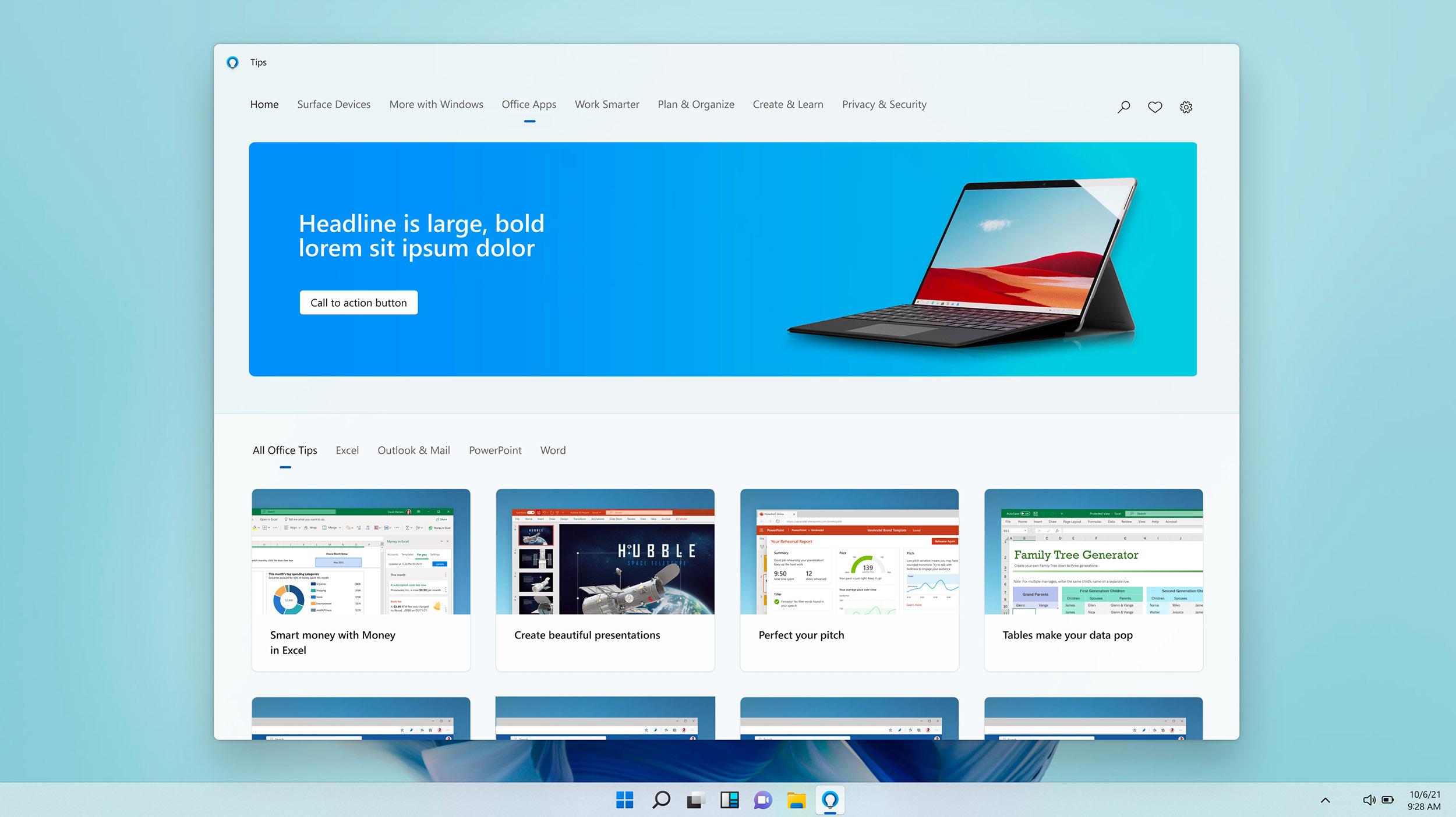
User selects Office Apps in top nav


Here the user has moved the top navigation pivot to Office Apps, which updates the card view to show only Office related tips. You can see that all the cards are showing Office content now. Note that the bottom navigation pivots have updated as well, allowing the user to further focus in on one specific Office app if they so choose. We’re making it easy and quick for users to zoom in to find the content they want in a visually rich and engaging way. 
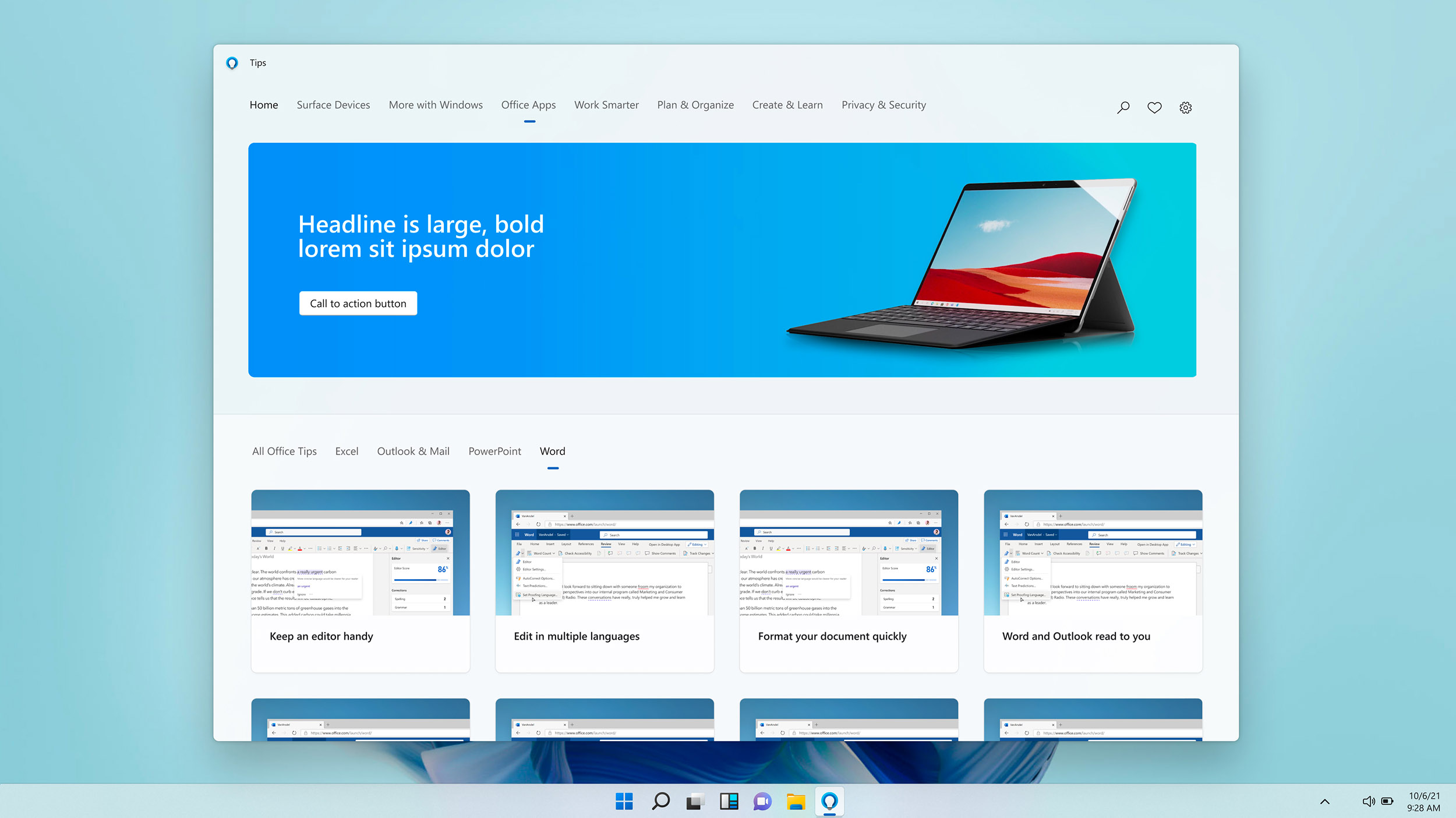
User selects Word pivot in L2 nav


In this view the user has selected Word from the bottom level 2 (or L2) pivot, which updates the card view to exclusively show Word-related tips. 
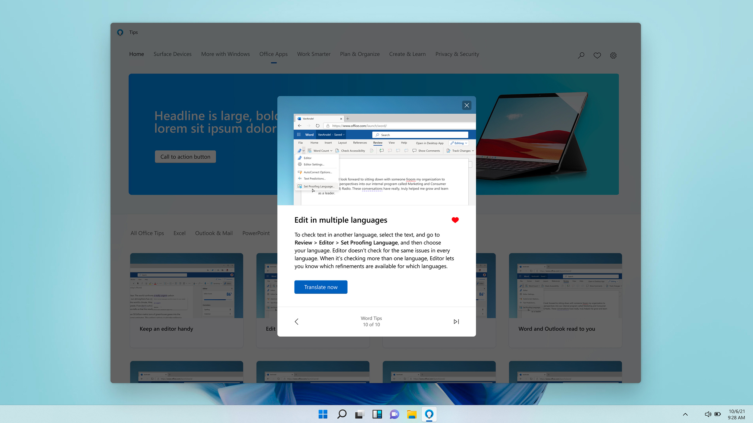
Individual tip is popped up 
(in contextually relevant place)


Once a user has clicked on a specific tip, the background fades and the tip information is front and center. Users can easily navigate through all the tips within their current section with the arrows on the bottom of the tip card. Here we are showing a user at the end of the series, viewing 10 out of 10 Word-related tips. Instead of dead-ending the user here, we change the right icon to a “skip to next chapter” icon, which allows the user quickly and easily continue on to the next set of tips. I am currently working with the developers to programmatically surface relevant tip sets with this feature (instead of pushing them on to whatever is next in our list.) This way the user has a smooth, coherent path to browse related tips if they desire — without having to go back to the navigation. 
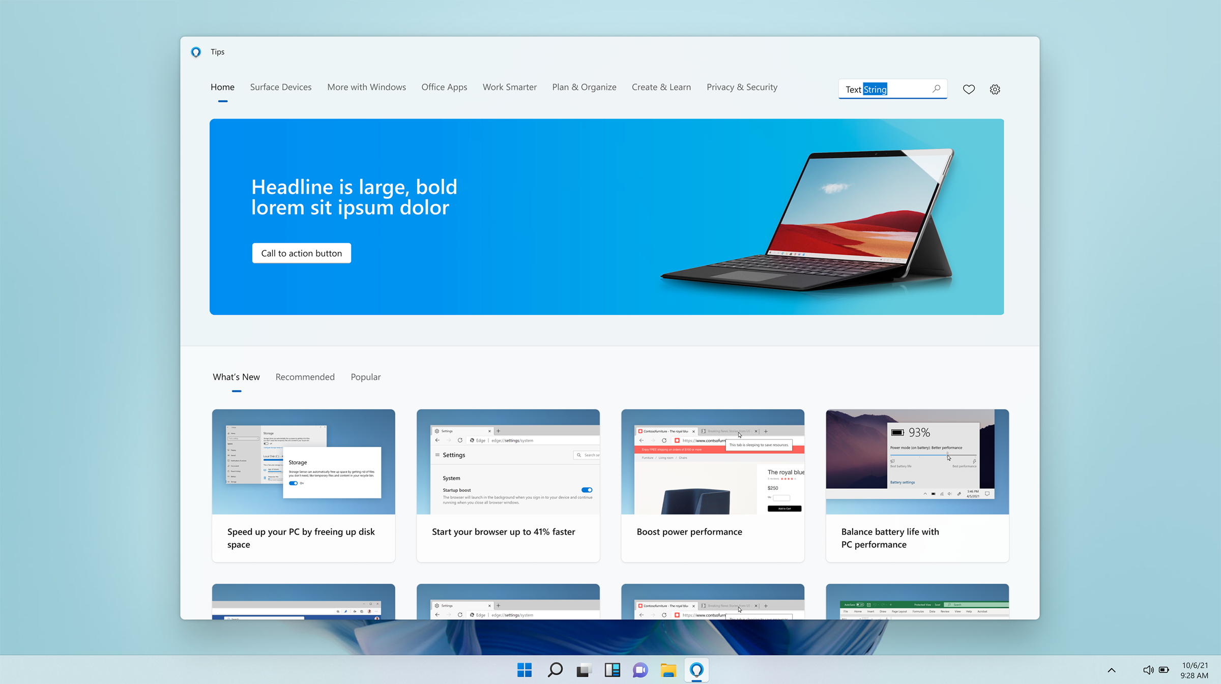
User searches for “Text String”
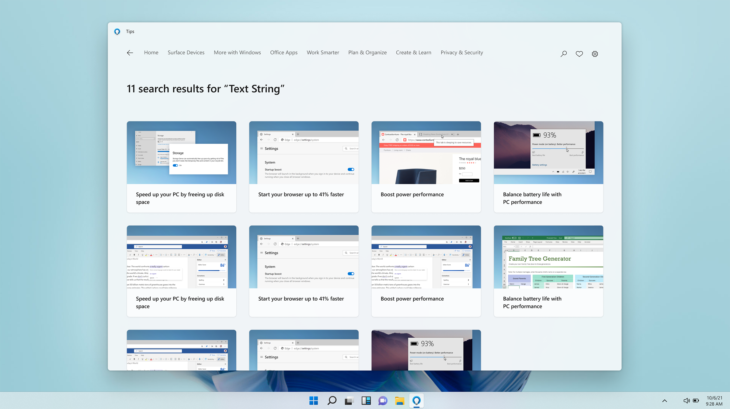
 

Here the user has clicked the search icon to expand the search field, and typed in “Text String” to demo the search feature.
11 search results


We happen to have 11 matches for this demo search, and display them all as tip cards for the user to explore here.
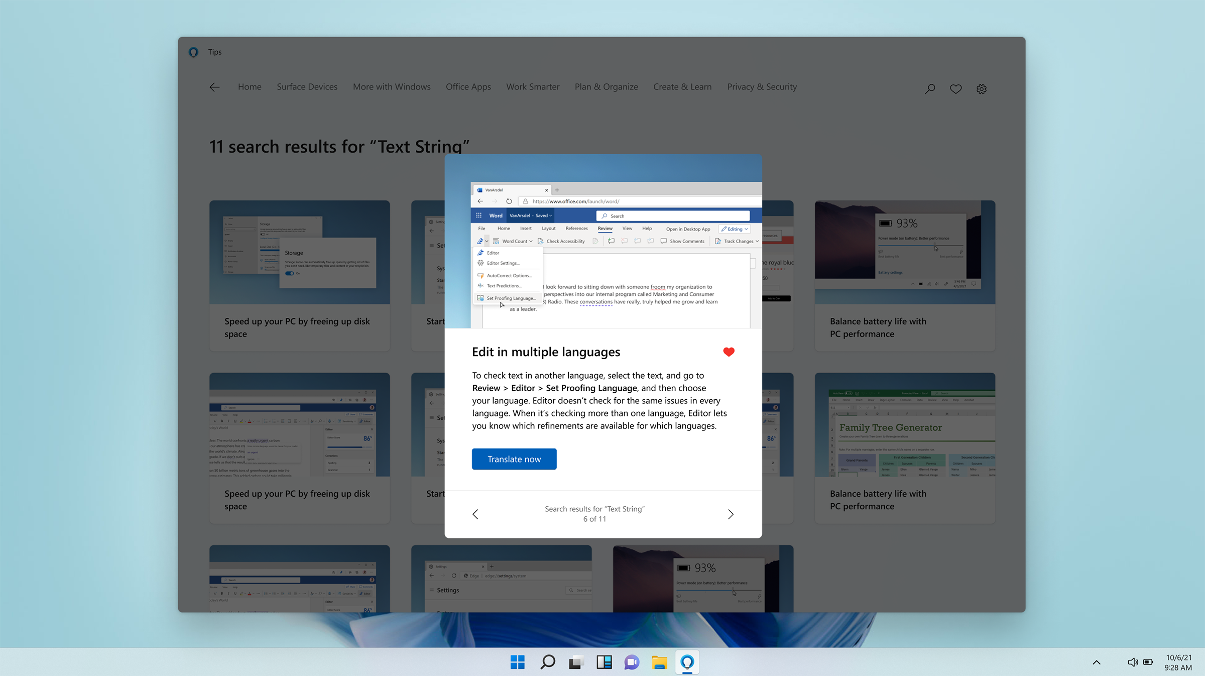
Tip card opened from search


The tip card is expanded after a user has clicked on one of the search results. We are again showing the card in context of the search query, labelled at the bottom of the expanded card with left and right arrows to quickly navigate between all the search results.
Already viewed tips


As the user navigates through the app we are busy behind the scenes dynamically moving previously viewed tips to the bottom, as shown here in the default “What’s New” section. This section is also auto-sorting by date — so only the newest, previously unseen tips are surfaced at the very top. This ensures that users are getting the freshest content available front and center. Viewed tips are visually distinct from unviewed tips, in that they are accompanied by a checkmark and use a thinner Segoe font weight with a lighter gray color to better differentiate themselves as “seen”.

Chris Hughes — Designer