About Panopto
Challenges
- The Panopto sales team faced consistent objections from potential new customers due to its clunky, dated look. Sales would actively hide the product from prospective clients — only emphasizing its capabilities verbally.
- The existing product was a mishmash of assorted controls, panels, screens and menus with very little standardization. This confused users and detracted from Panopto’s credibility. We needed to get all our design components organized, standardized, and centralized using a design system, ideally using React components to speed up dev execution.
The Team
I worked alongside our design director and another UX designer. I owned all visual and interactive aspects of the redesign and design system. I collaborated extensively with developers, PMs, QA engineers, and various stakeholders. I met with customers to conduct user research alongside the rest of the design team.
Goals
- Improve conversion & retention rates by revamping aesthetics to reflect a modern video platform, with minimal changes to functionality given limited dev resources
- Implement a design system and customized React components to enhance standardization & consistency throughout the product, as well as increase dev execution efficiency and agility
- Improve usability by engaging with our customers directly as a design team to better understand their unique workflows and pain points, empowering our design team to better provide solutions to improve their experience with the product.
Solution
Research
- Research took top priority with a strategic 6-month pause in our design efforts, as we had recognized the need for a deeper, more nuanced understanding of our users’ experience. We learned about their unique workflows, dove into their pain points, and uncovered the subtleties of their frustrations when interacting with Panopto. This process wasn’t merely about problem-solving; it was about fostering genuine customer empathy, gaining a holistic understanding of their experiences, and leveraging this knowledge to drive solutions tailored to their real-world challenges.
- Competitive landscape assessment: we worked on a comprehensive competitive analysis to better assess current industry standards and emerging trends.
Implementation & Action
- Without being asked, I immediately got to work on creating, refining, documenting, deploying and socializing a unified design system — rationalizing every component’s use and specifications.
- I completely overhauled design across the product, using insights gained from our user research phase and implementing standardized components from the new design system.
- We had severe dev resource constraints so I created a roadmap with relevant deliverables, specs and redlines to steadily release design enhancements every two weeks.
- I closely collaborated with engineering to deploy the new design system and associated React components, keeping leadership looped in on our progress, adjusting course as necessary.
- I wrote and designed content for external communications, keeping customers informed on Panopto’s design evolution (announcement emails, blog posts, etc).
Transformations, Impact & Results
- Design team cost savings — greatly reduced the amount of effort required to generate new layouts and user flows, empowering us to do more with less resources.
- Dev team cost savings — migration to a design system using React components meant that one single full time front-end dev was able to handle a complete product redesign.
- Positive customer feedback — improved confidence in our product’s quality, with customers reporting far less frustration after we had worked to resolve the pain points and frustrations we had uncovered in our user interviews.
- Improved conversion & retention rates — as a result of elevated design standards, enhanced usability, a simplified UI, and improved UX.

Assessing the Existing Design
- Numerous pain points related to customer workflows (“I use this every day and spend way too much time on it — make this workflow simpler”)
- A non-intuitive display of information and actions, leading to confusion (“This could be labelled much more clearly”)
- Cumbersome and convoluted processes for simple tasks (“It takes too many clicks to perform this action”)
- Inconsistencies in UI elements, causing confusion a lack of trust in the system (“Why does the same feature work and look one way here, and another way there?”)
- Difficulty locating frequently used actions, affecting efficiency (“Why do I need to load up the settings panel and navigate through it to perform a simple task on a video?”)
Accessibility Concerns:
- The existing color palette did not adhere to accessibility standards, specifically regarding color contrast. This jeopardized the user experience for visually impaired users and failed to meet inclusive design principles.
Layout & Spacing Issues:
- The existing design had a dated, cluttered and claustrophobic layout, with padding inconsistencies. Users felt overwhelmed and disoriented due to the sheer volume of clutter and tight spacing.
I took all of these issues into account when working on the Panopto redesign and design system.
Design System Creation & Implementation
Systematic Cataloging:
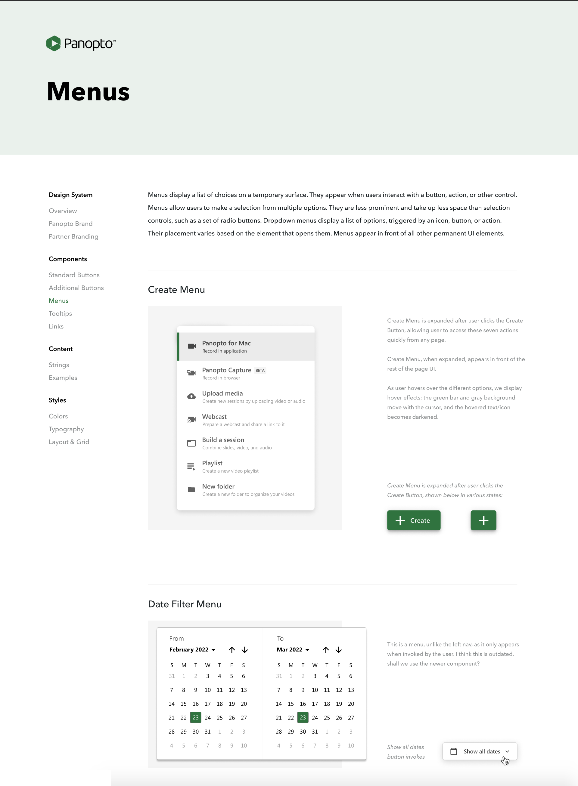
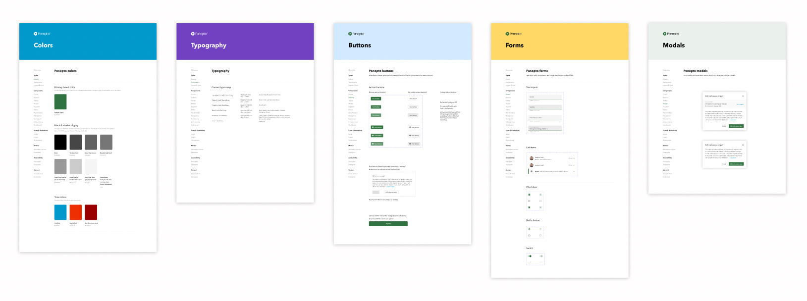
- Process: I created and curated Panopto’s design system, meticulously creating documenting each modernized UI component ranging from video thumbnails and type ramps to buttons and menus. I built it as an interactive navigable prototype to be shared with all levels of the org.
- Outcome: Eliminated ambiguities by ensuring that every element had a defined specification and style, drastically increasing our speed of development. This was especially helpful with offshore dev resources working in different time zones.
Before building out the design system, developers often had to resort to guesswork or frequent consultations with designers for design specs and details. By making the design system interactive and easily accessible, it served as a clear guide for developers and provided the entire company with a single, unified source of truth, vastly reducing back-and-forth discussions, ensuring efficient execution.
Through the creation and deployment of this interactive design system, we achieved a harmonious balance between creativity and standardization. It’s not just about a consistent look and feel – it’s about empowering both designers and developers to work together seamlessly, enhancing productivity and ensuring a unified user experience across all our digital platforms.
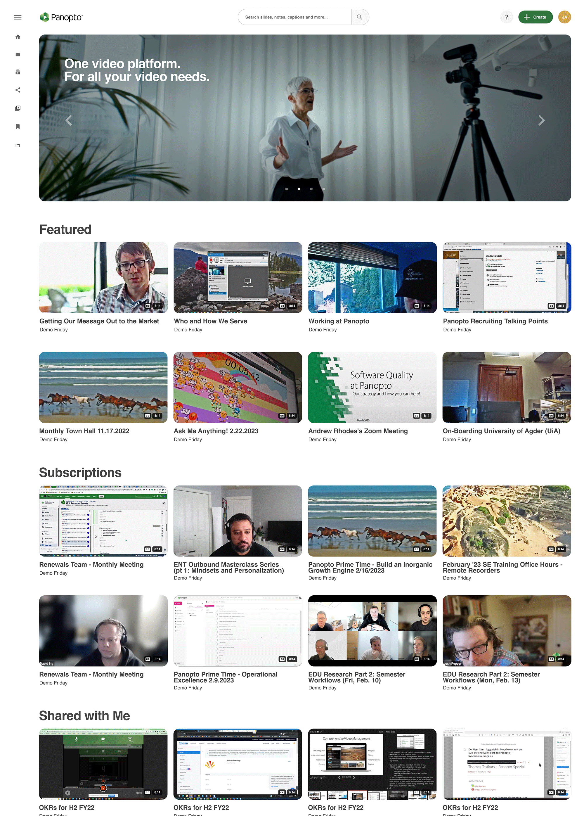
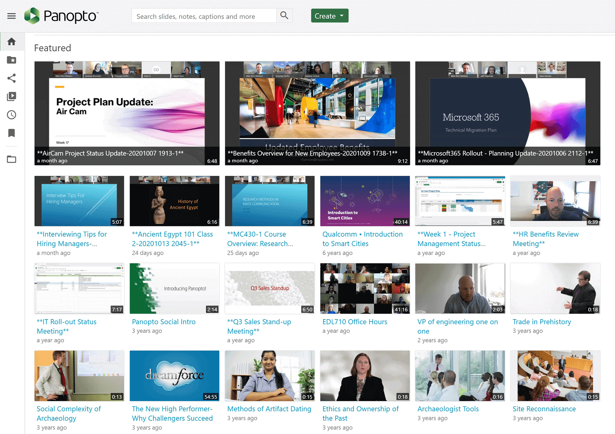
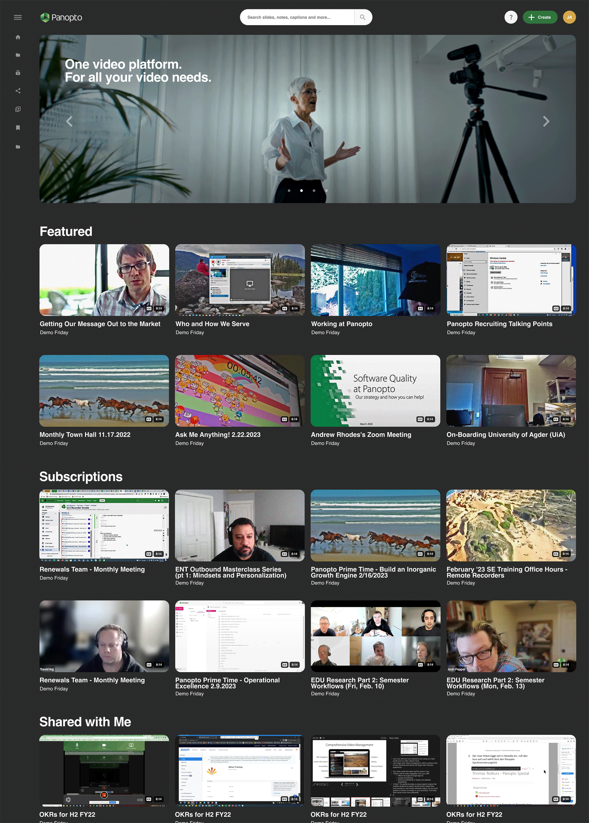
Modernizing the Homepage
- Spacing & Padding: Fixed the padding issues with the existing design — creating a cleaner, more organized layout.
- Type Ramp Integration: I used the design system’s type ramp for consistent typography, ensuring proper contrast between font sizes.
- Bold Visual Focal Point: Introduced a single wide carousel at the top of the page to promote featured campaigns (replacing the previous multiple slightly-larger video thumbnails, which lacked contrast and boldness).
- Quick Actions: I moved the most commonly used actions into the video thumbnails, allowing quick and easy access without clutter or visual noise.
- Modern Video Thumbnails: Transitioned to rounded corners, giving a friendlier and more modern feel.
- Night Mode: Responding to persistent user requests, I introduced an optional night mode design for the site.
Collectively, these nuanced enhancements transformed the homepage into a more cohesive and visually appealing experience.
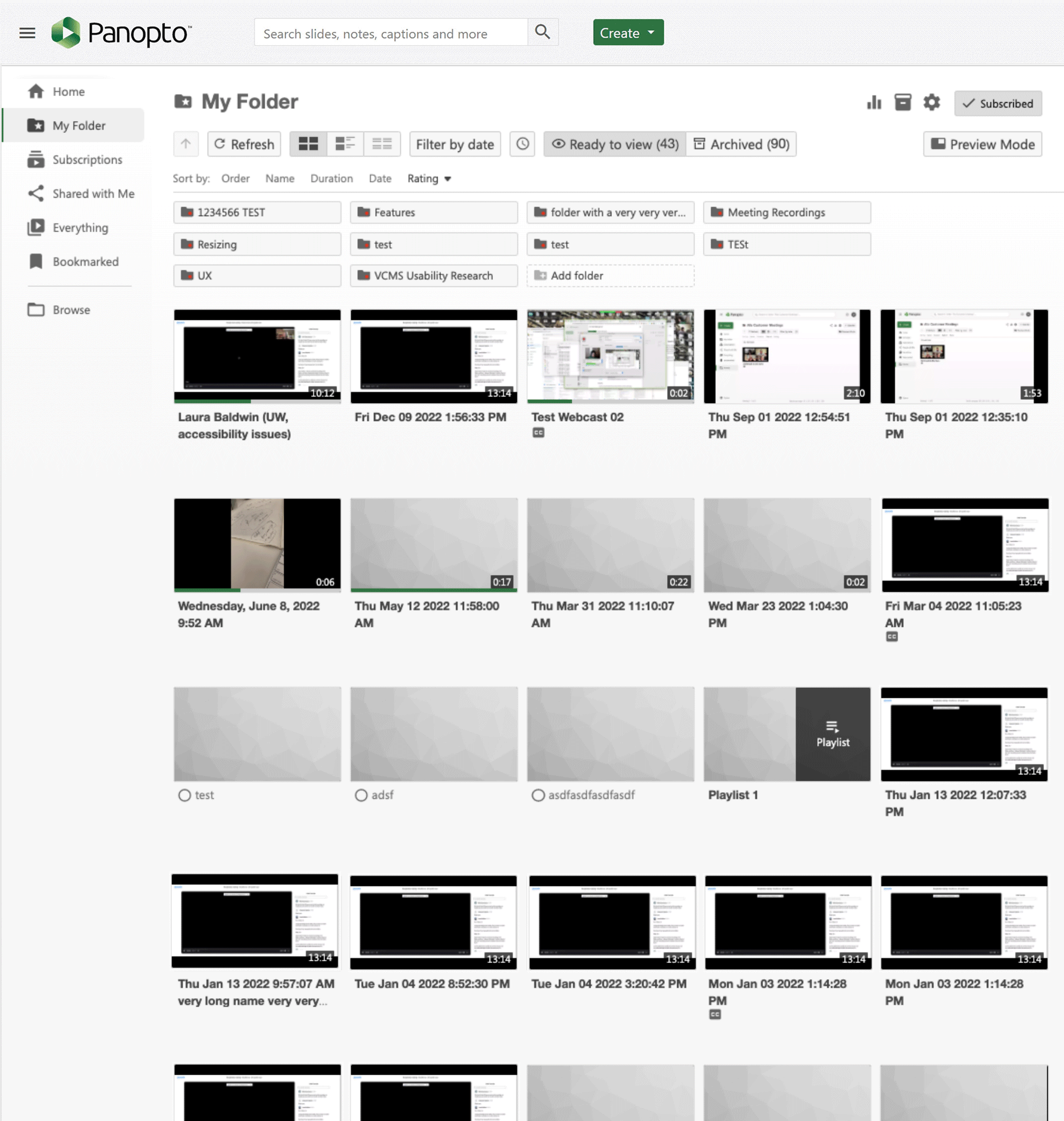
Folder Pages layout — before redesign
- Overbearing UI: The filtering / sorting interface was disproportionately dominant, diverting attention from the main content.
- Content Overshadowed: The primary content (video thumbnails) seemed relegated to the background, making it feel secondary despite being the core focus.
- Inefficient Use of Space: The layout suffered from improper spacing, resulting in a cluttered and “visually noisy” appearance.
- Lackluster Header: The page header, a crucial element for first impressions, lacked any semblance of vibrancy or visual engagement.
- No Visual Representation of Hierarchy: When the user is in a nested folder, they have no way to see the hierarchy structure.
This backdrop laid the foundation for a crucial design overhaul to elevate the user experience.
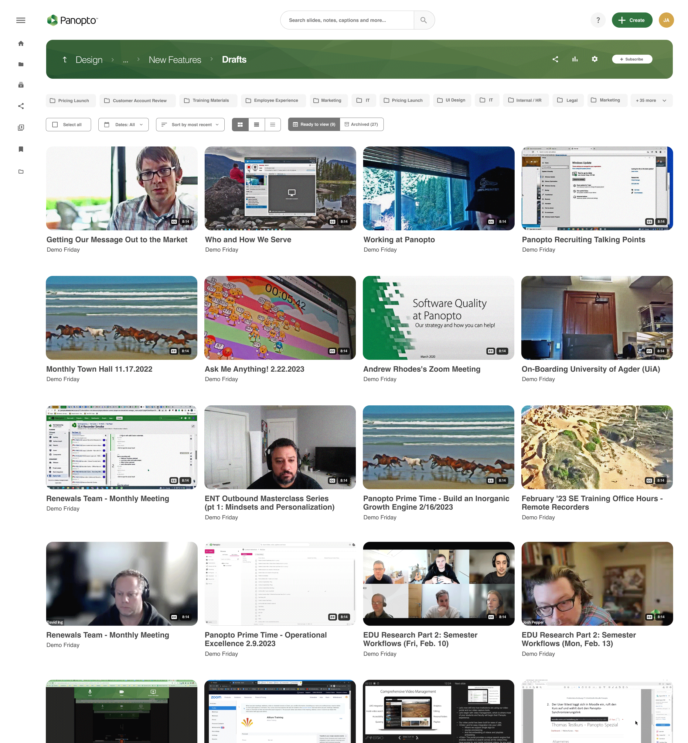
Folder Pages layout — after redesign
- Content-Centric Approach: In an effort to prioritize “content over chrome” the redesign brings video thumbnails to the forefront, ensuring they have the attention they deserve.
- Refined Filter Tools: The filtering and sorting tools are now redesigned and seamlessly integrated — easily accessible yet non-intrusive, striking a balance between functionality and aesthetics.
- Enhanced Spacing & Layout: The redesigned pages have a more harmonious, modernized and organized look.
- Vibrant Header Redesign: The header was given a splash of color and texture, giving a focal point to the top of the page. I worked with the dev team to build this out as a dynamic SVG asset that can receive any color value passed to it.
- Visual Navigation for Folder Hierarchies: Recognizing the challenges of navigating intricate folder structures, the redesign introduces a visual navigation system. This allows users to visually traverse complex folder hierarchies.
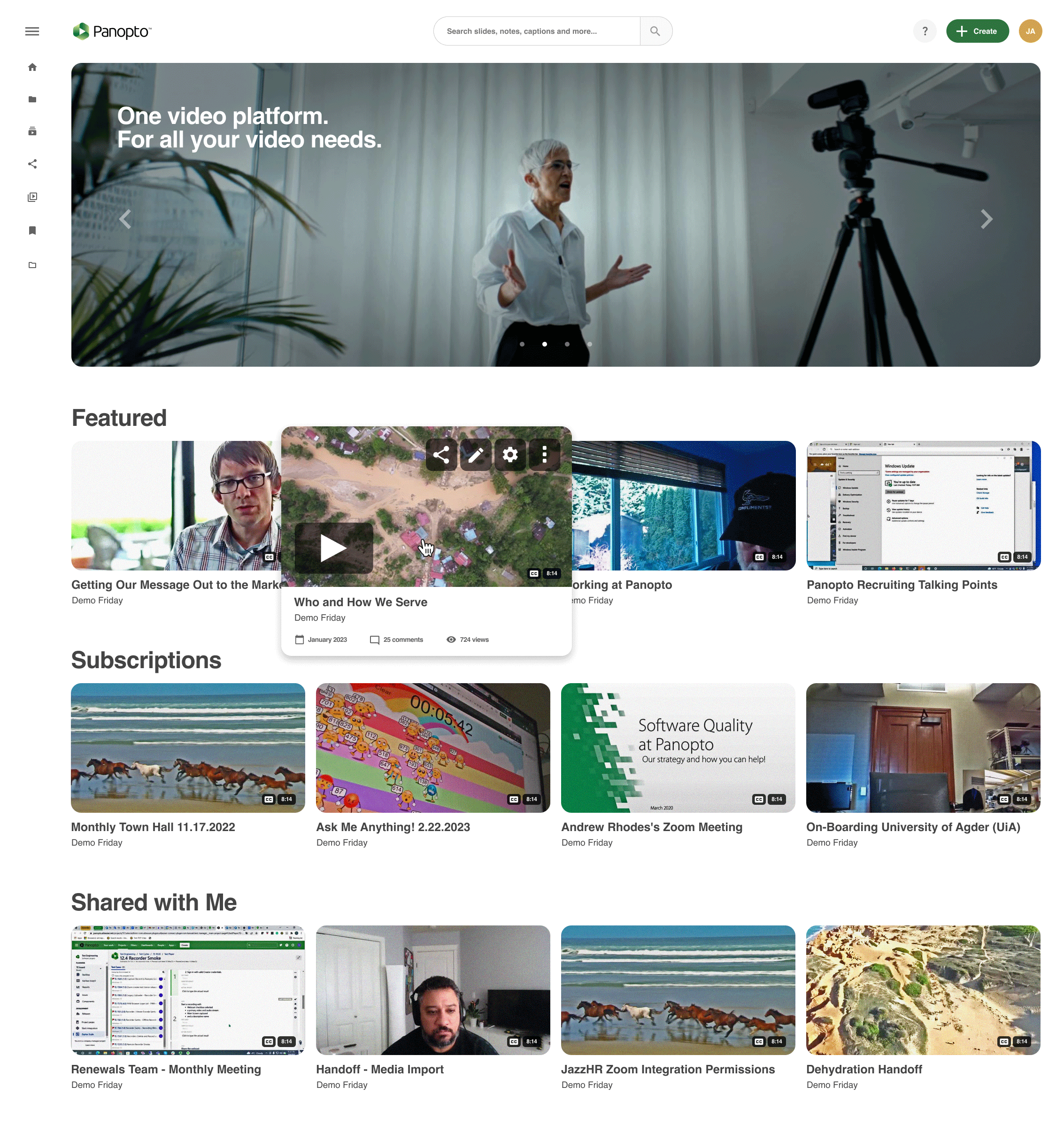
Elevating Interactivity with the “Play in Place” Feature
- Instant Playback: Users can immediately play a video preview right from the card, eliminating the need to wait for a new page to load to play the video – aligning to to the seamless experience we had aimed for.
- Quick Actions: Accompanying the playback option are quick action icons, allowing users to share, edit, adjust settings, or undertake admin-related tasks directly (again, we are saving users clicks by putting often-requested actions right here at their fingertips).
- Informed Choices: With this enhanced hover feature, users are empowered to gain valuable insights about each video, enabling them to instantly discern which content matters most to them.
The design ethos behind this interaction was to create more value for the user by making content discovery both intuitive and efficient.
Chris Hughes — Principal Designer