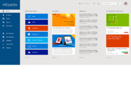
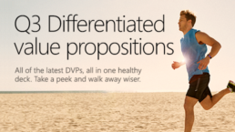
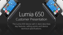
From Windows 8 through to Windows 10, Infopedia has offered a “reader app” to give users a quick and convenient way to access the millions of pages of content and media.
Using a dedicated app has several advantages over relying solely on Infopedia’s web interface. Content loads more quickly, and can be personalized to sit users’ tastes more easily.
What a difference with this fresh update — so beautiful, looks awesome! Thanks Chris!!!
Charl-Lee Pearce
Windows 10 app
I was responsible the design of the touch-optimized Windows 10 app experience for Infopedia, which integrated personalized training, a vast media library, demos, and the very latest product information to help Microsoft’s sales team perform their best.
This Windows 10 update abandons the Windows 8 style horizontal scroll in favor of a vertical scrolling layout. The featured content is given more real estate than the previous build, and an entirely new look and feel was introduced to better match Windows 10’s chrome and styling. This was a bold design move, raising the bar of visual impact at Infopedia.
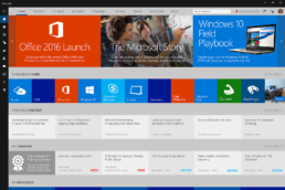
The top news carousel automatically scrolls horizontally, and each image was hand-crafted to yield maximum visual impact. See below for more samples showing the “featured content” news teaser designs.
Windows 8 app
One of my very first projects with the Infopedia team was to design a Windows 8 app experience; previously there had only been a web portal to access Infopedia using a browser. The design requirements were to keep the layout simple and modular, yet feature the top hubs, news, trending content, personalized training and alerts in a consistent, visually appealing manner.
This design launched in parallel with the portal homepage redesign, more on that coming soon…
