Background
Problem Statement
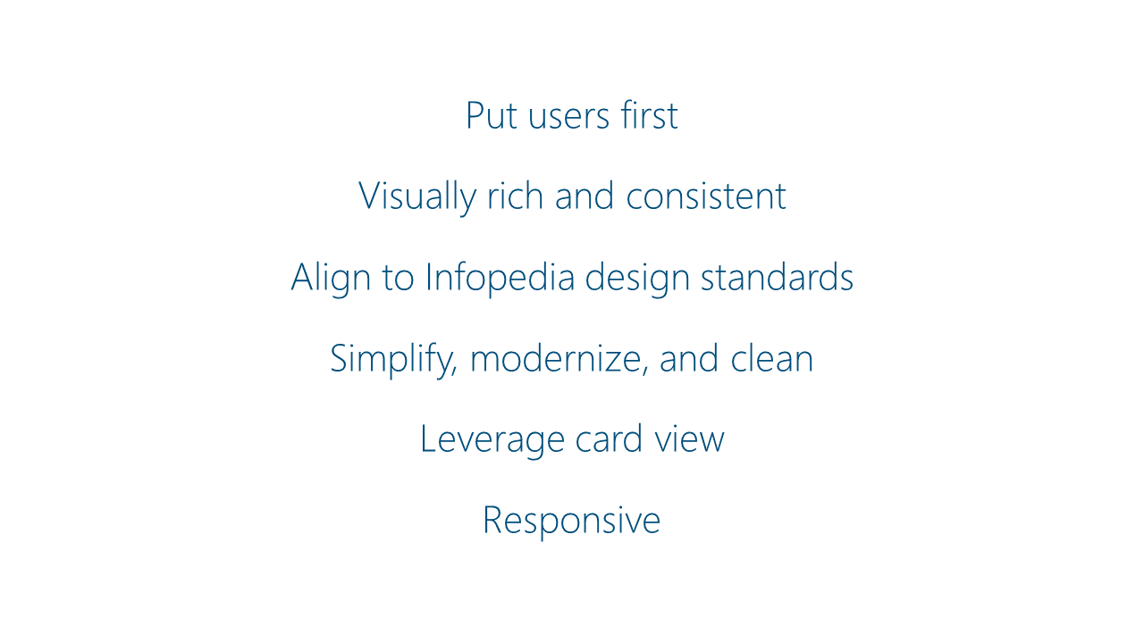
Project Goal
Process
Results
Chris Hughes — Designer
What a difference with this fresh update — so beautiful, looks awesome! Thanks Chris!!!
Charl-Lee Pearce, Business Program Manager, Infopedia Media
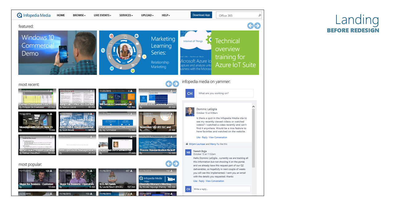
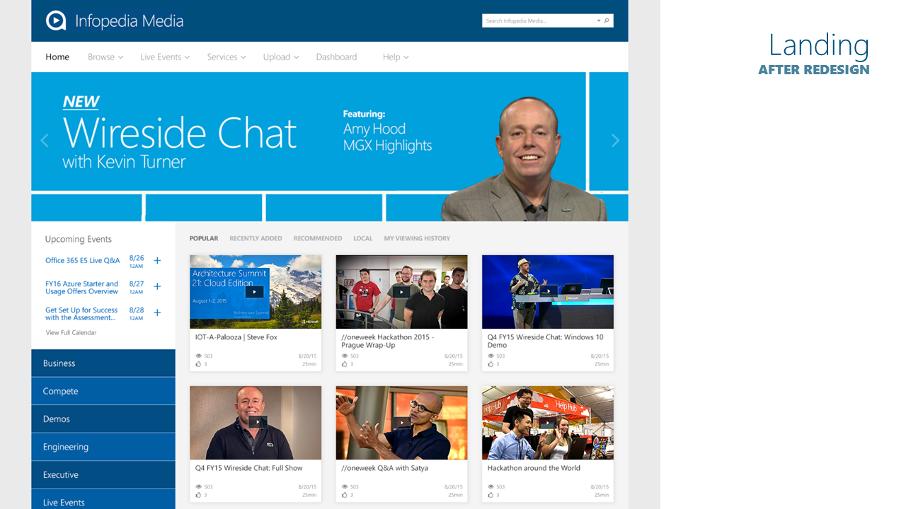
Landing Page
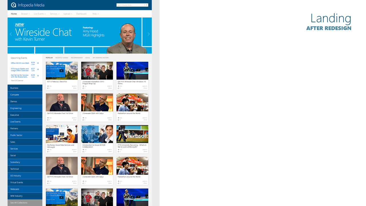
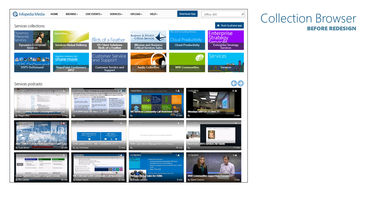
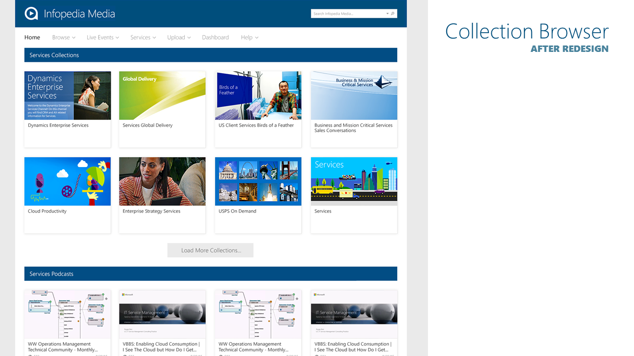
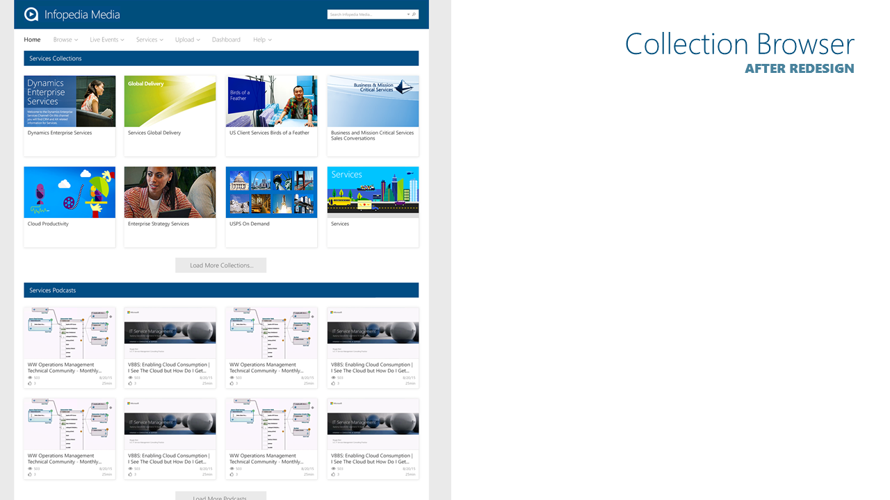
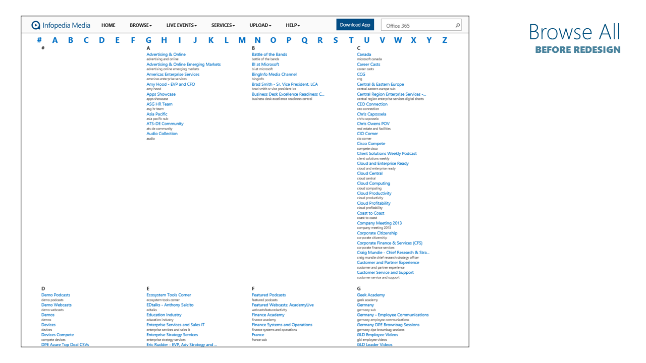
The Infopedia Media brand received a stronger treatment, and the larger full-width dynamic news carousel allows for important announcements to provide much more visual impact. Previously, videos were completely obscured with metadata covering the thumbnails; now, with the introduction of standardized cards, the thumbnails are clear and clean.
The transition to a modern card-based layout also made it feasible to execute responsive designs for tablet and phone. The entirely site is now fully responsive. I oversaw the redesign on this project, working with the stakeholders to run design reviews, iterating through multiple rounds of mockups, and ultimately producing all discrete UI elements, redlines, and functional specifications for the development team to build from.
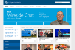
Refinements include more impactful branding, a larger search box, more spacing on top navigation elements, full-width visual news/feature carousel, integrated dynamic events calendar, filter pivots to instantly refine the card view, with the overall design style updated to match the newly launched Infopedia site.
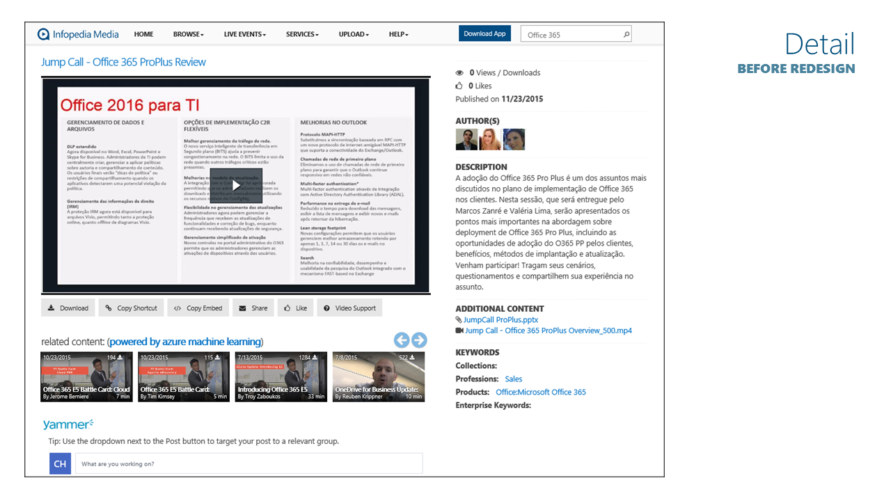
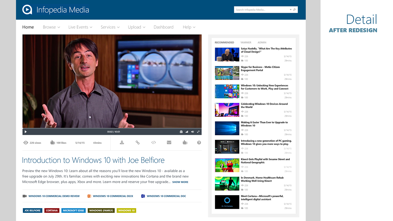
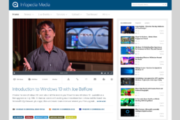
Video Detail View
The video player itself has been enlarged to provide a much more engaging experience. Recommended videos appear on the right. Longer video descriptions are truncated after three lines of text (with the option to reveal the remaining text), so that related assets and video tags can be shown below. This results in all the information a user needs to make sense of the video available without needing to scroll — all within a clean, modern and engaging experience.
If you’re on Microsoft’s internal corpnet network, take a look at //ipmedia to see this live. (Infopedia Media isn’t accessible to the general public.)
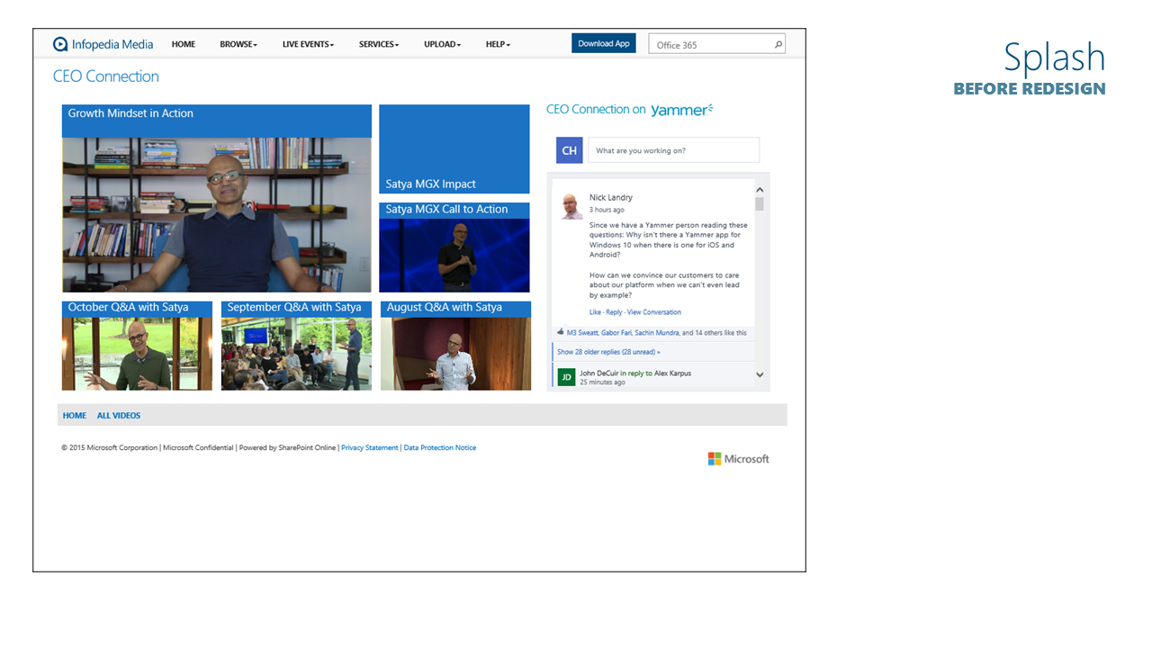
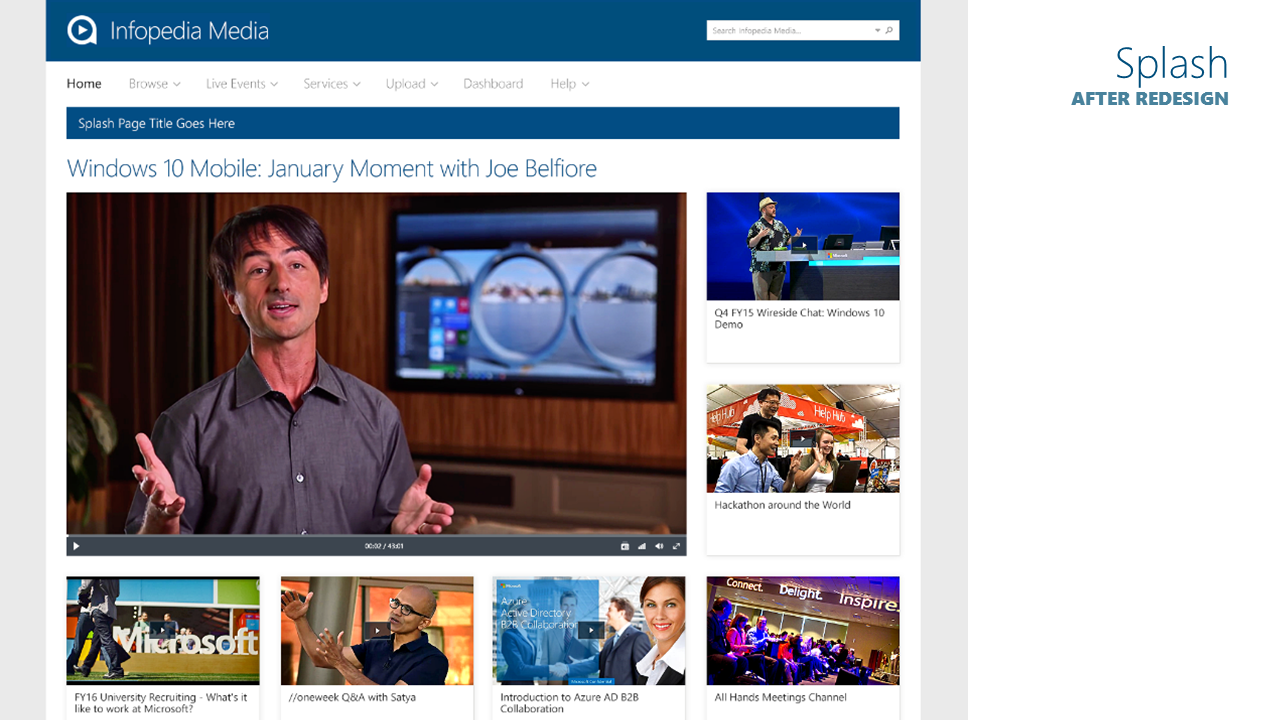
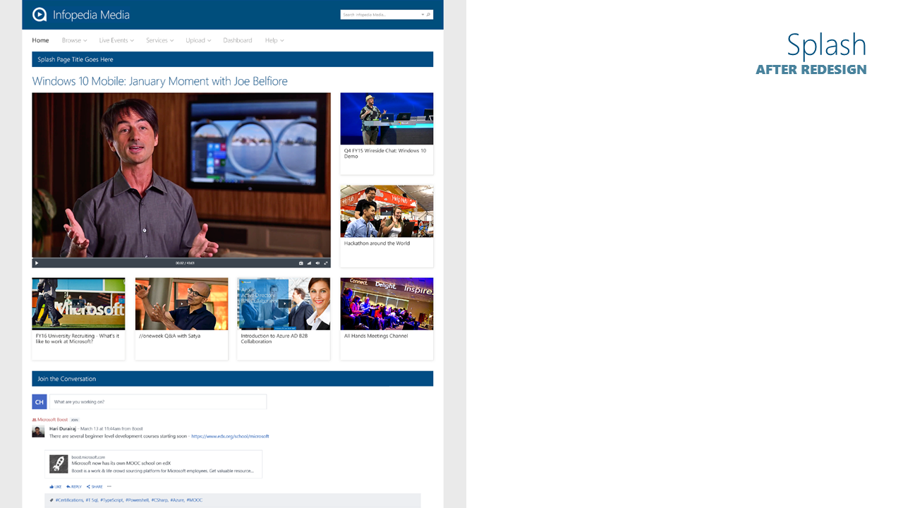
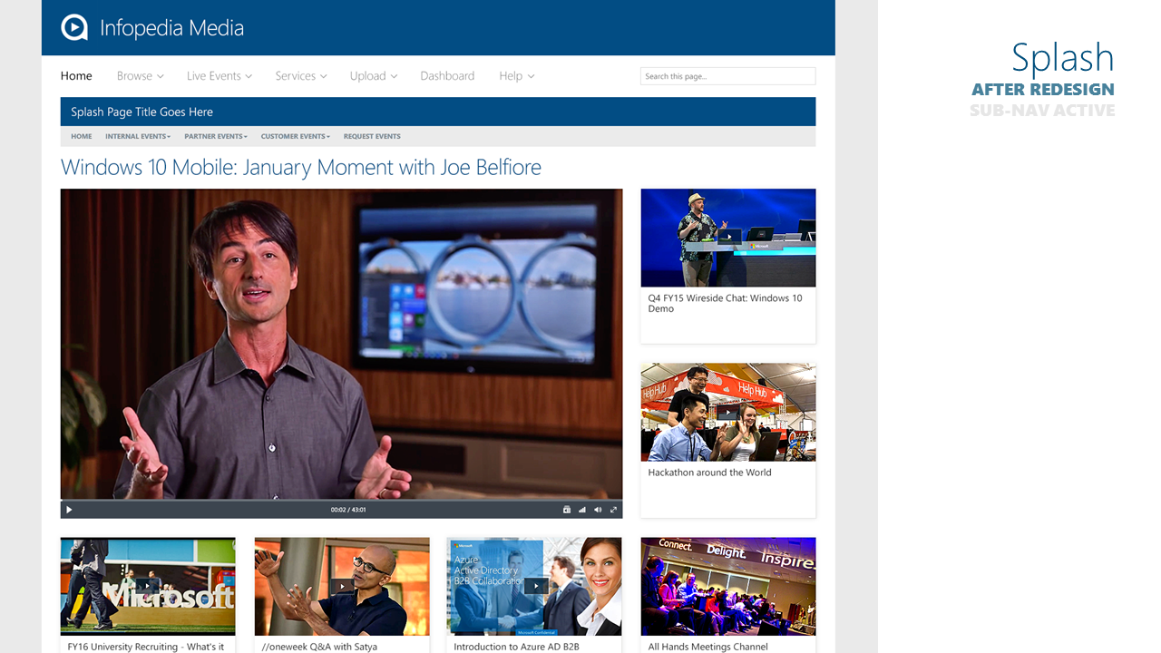
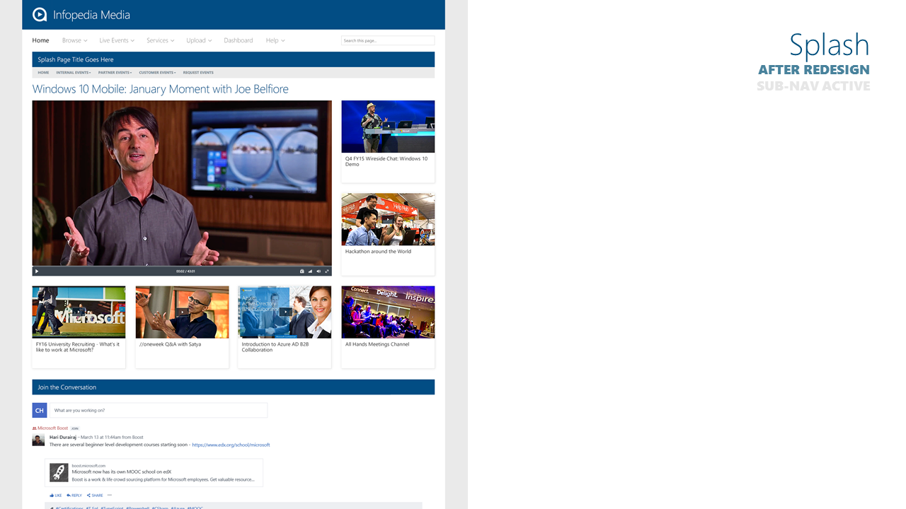
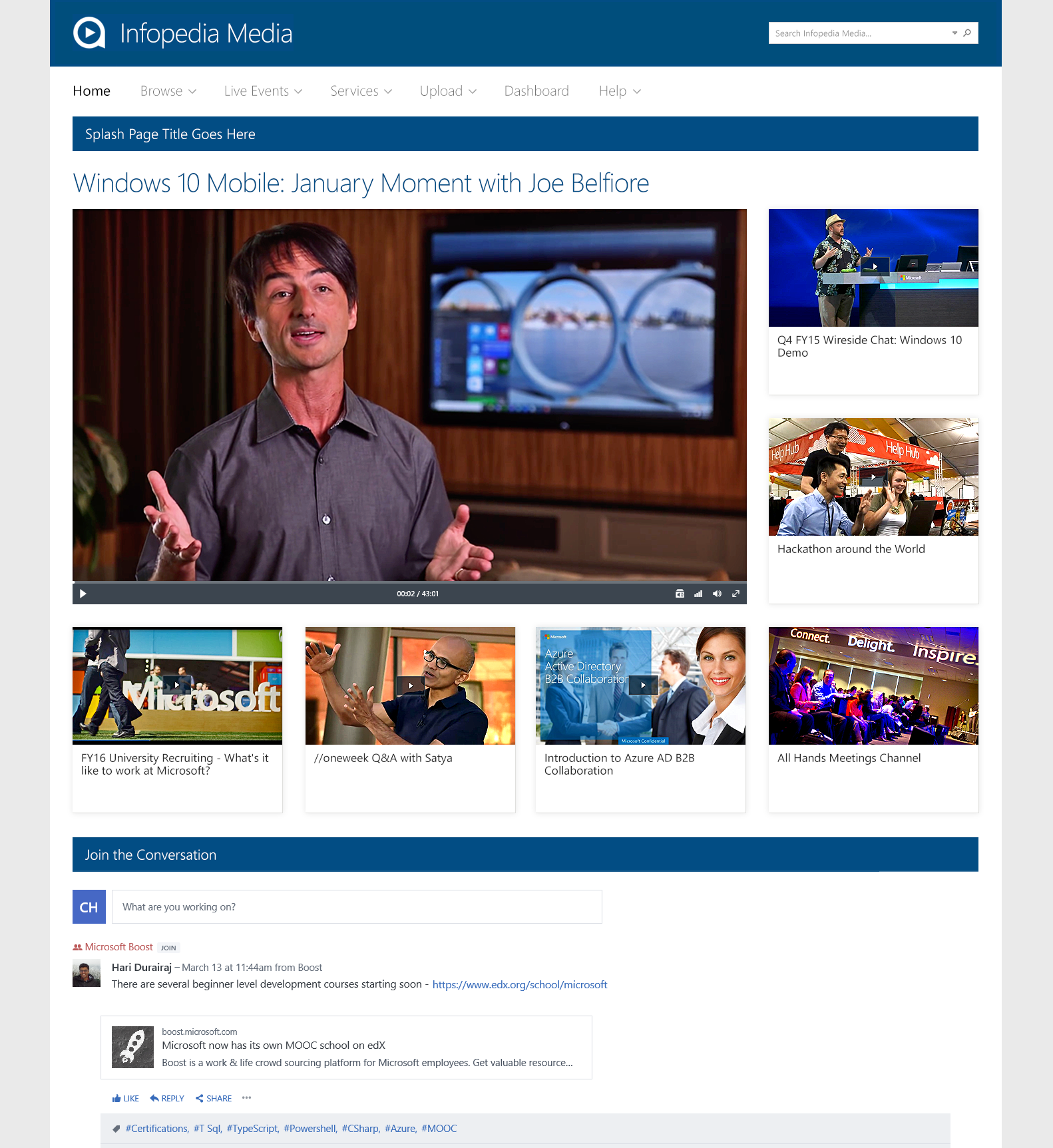
Splash Page
The splash page introduces a group of related videos, with one large video front and center. There’s an opportunity to join in on the social conversation around the topic below by using an embedded Yammer module that’s been styled to fit in with the overall Infopedia Media design.
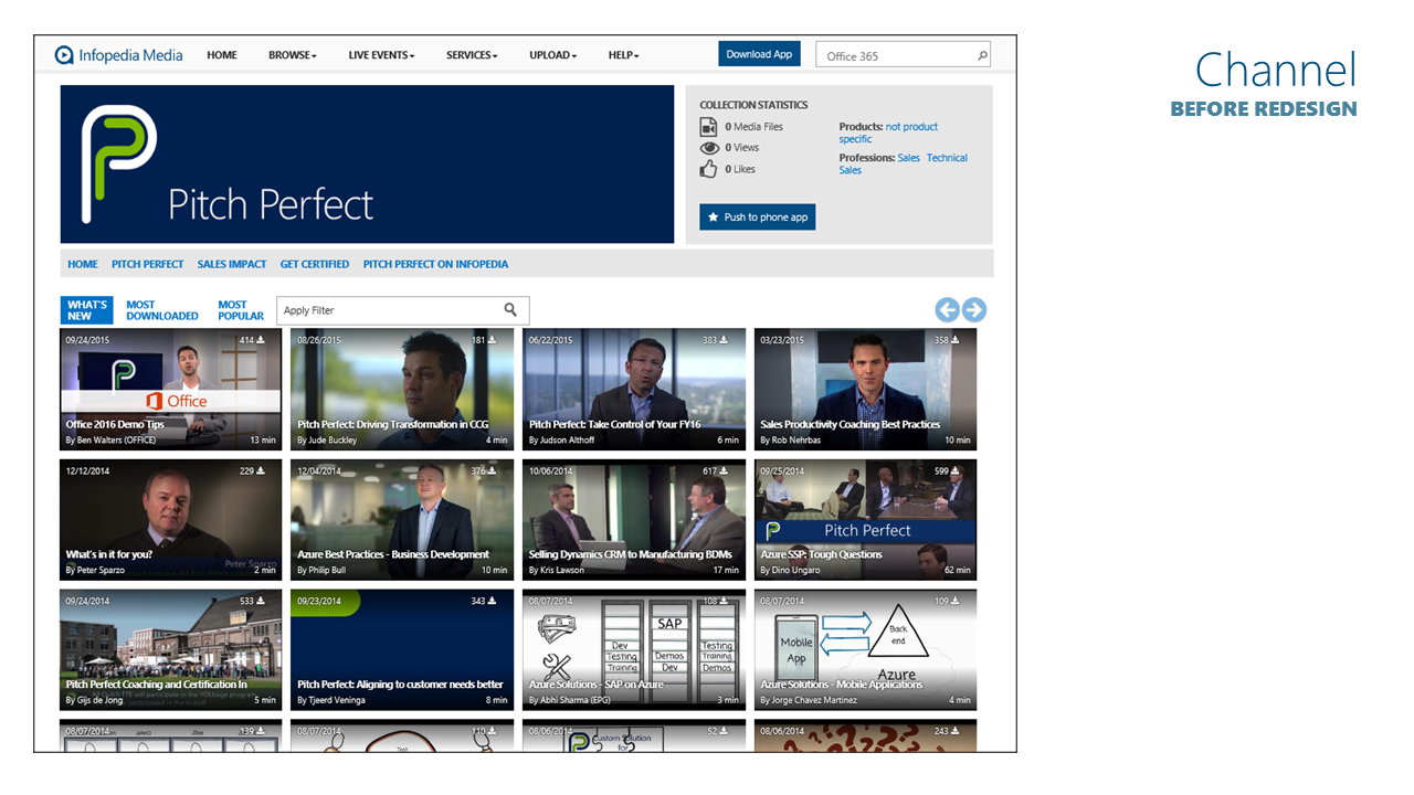
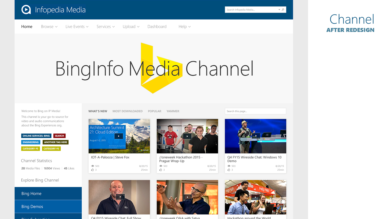
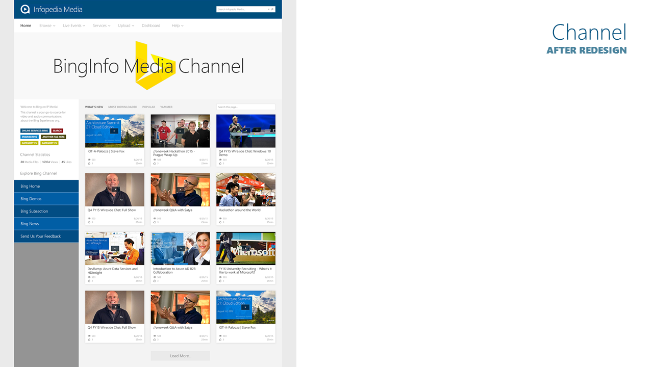
Channel Landing Page
A big part of Infopedia Media is the channel experience. A channel is a subset of videos that relate to a specific topic — such as an industry, a product, or a person. This channel experience was upgraded by giving channel owners full-width banners to more effectively brand and promote their pages with maximum visual impact. A dynamic live search specific to the channel page was added to help users instantly sort through content, dynamically filtering through the cards for desired topics and keywords. On the left a short channel description is shown, along with colored topic tags and channel statistics. Sub-channel navigation is provided in the bottom left column, allowing users to navigate to child pages of the master channel page.
Before and After "Pitch Deck" Design Presentation
I prepared this presentation to visually demonstrate to stakeholders and senior management at Microsoft the design changes I was proposing by contrasting snapshots of the previous screens with the redesigned pages. The presentation was well received, and development on the redesign started immediately. I worked closely with the engineers, onsite and offshore, to get the design and functionality brought to life with pixel-perfect accuracy.