2016 marked the third year of //oneweek, which brought employees together as they worked on projects that inspire them. //oneweek was an exciting opportunity to see and demo the latest Microsoft products, ask questions about what’s coming in the next fiscal year, volunteer in their communities and celebrate their accomplishments. There were more than 3,200 registered Hackathon projects, with employees hacking everything from bots to Microsoft HoloLens.
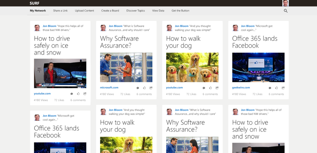
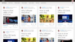
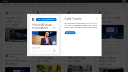
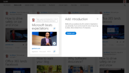
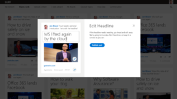
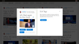
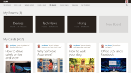
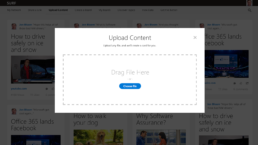
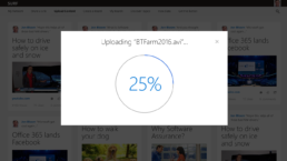
For this year’s hackathon submission, I was asked to design a social media sharing site to help foster knowledge sharing among Microsoft employees. The proposed system uses machine learning to automatically tag and sort submitted content; all that is required from the user is to provide a file or URL, give a brief introduction, and the backend does the rest of the work automatically — the system automatically picks an appropriate photo, crops it to fit on the card, suggests a card title, etc.
I designed the user interface mockups for this submission to make the entire user flow process as simple, clean, modern and intuitive as possible.
Hackathon Design Presentation
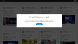
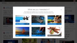
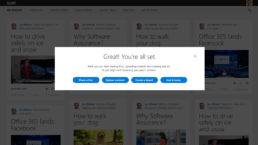
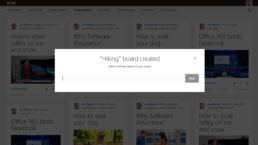
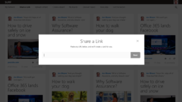
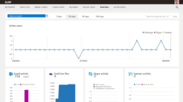
I prepared this presentation to clearly show the user flow through all stages of the site, including adding media via pasting a URL or a direct upload, adding a personal message, accessing statistics, and other activities. All presented UI designs are high-fidelity: polished and pixel-perfect.


