The Office Telemetry group was tired of manually sending out error reports affecting their product deployment — and were equally tired of the potential for errors that came along with this method. They were hoping to consolidate and modernize their existing method of emailing Excel documents back and forth to keep their group up to speed.
Project Goal
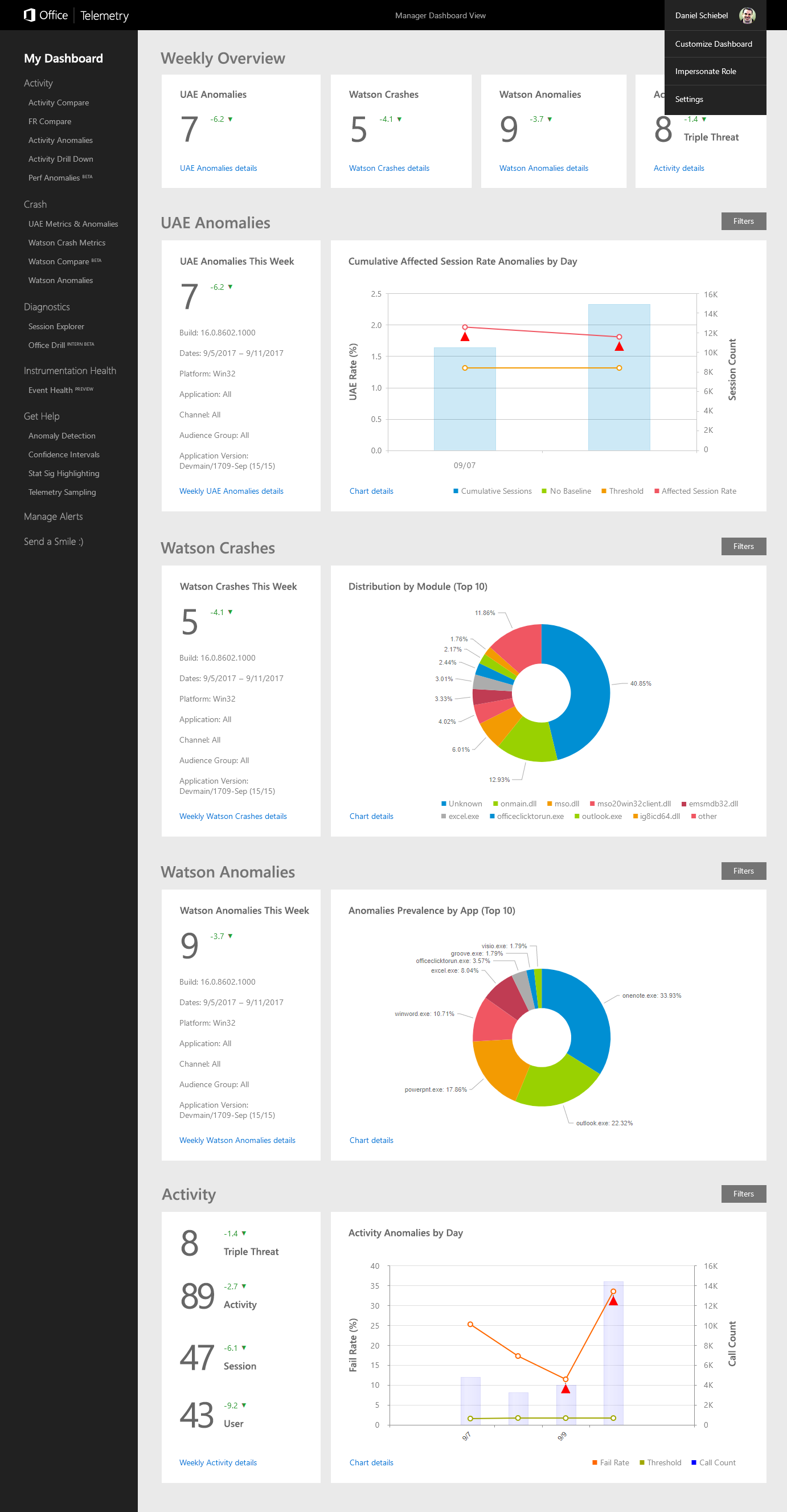
The goal was to replace endless Excel documents with produce a centralized easy-to-use visual dashboard view of these issues. This solution engages the user with rich charts that are tailored to their specific user persona (executive, engineer, tester, etc) and allows plenty of flexibility in how the data is shown.
Process
After meeting with the stakeholders at OTEL, studying their user personas and existing Excel framework, I produced this design solution in an afternoon. Users can customize the view by subscribing to topics and modules that are relevant to them, so that they appear on the dashboard by default. Actionable insights are shown up top; users can dig deeper into any desired area with a click. Users may impersonate other personas, and are provided with the ability to dynamically re-filter charts inline without requiring a new page load.
Results
The stakeholders at OTEL were very pleased with this design proposal. It effectively ends the old method of reviewing endless Excel documents, reduces the potential for errors, and allows the OTEL group to make quicker decisions by highlighting actionable insights relevant to the specific persona while allowing flexibility and customization.
Chris Hughes — Designer, UX Researcher, Project Manager