The Codega was a live music booking and promotion group in Los Angeles. I was involved in this edgy rebrand, as well as creating various poster and flyer designs promoting artists, shows and venues.
As one of the primary bookers in the Los Angeles music scene, The Codega (formerly Can of Jam) has established a brand of excellence in live music event promotion and production. Notable venues include The Hard Rock Cafe, The Viper Room, The House of Blues, The Key Club, The Joint, The Derby, and The Mint.
The fliers designed by Chris Hughes look top-notch and are guaranteed to give people a good impression about your band and your show.
Joey Flores, founder and CEO, Earbits
Posters and flyers
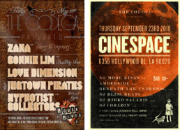
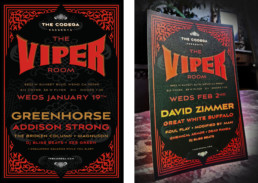
In designing creative promoting various events, I wanted to ensure that they stood out from the crowd. My main directive was to make each one visually arresting and completely unique — so that people would actually talk about the poster just as they would talk about the show.

The House of Blues poster design (left) uses layered antiqued background textures and uniquely decorative typography to evoke and parallel the ornate interior decor of the Parish Room and the Foundation Room, a members-only restaurant and lounge. The walls are covered with exotic and ancient Indian fabrics, the ceilings with sculpted material rescued from buildings hundreds of years old, and the bar railings are made from pieces from ancient Indian temples.
The Viper Room
The Viper Room flyers introduced a distinctive filigree design surrounding the venue brand and show information. The color palette was pared down to the essentials: red and gold for the venue and event info, and white for The Codega’s promotional info. Ample vertical spacing separated out and groups the blocks of text nicely.
Branding The Codega
Shifting the branding from Can of Jam to The Codega was an interesting project. As EDM acts started to become part of the booking roster more and more during the late 2000’s, the group wanted to establish a resonance with a wider array of performing artists and venues. The idea for The Codega was born, a term originating from the Middle Ages. Visually, the branding was to evoke both the ancient past and the future. I created the grungy, distressed silver logo and combined it with antique elements to fulfill these requirements. As with the poster and flyer designs, the distinctive look of the branding does an effective job at setting it apart from any competition.


